Usage Dashboard
PkgCo is a software dependency management solution, their enterprise customers found it difficult to gauge their monthly usage on the platform, especially when they exceeded their monthly allocated bandwidth and storage for the account. The goal was to develop a solution which would help organisations to manage bandwidth and storage more efficiently.

The problem
Customers are allocated a monthly amount of usage for both bandwidth and storage. If this allocation is used up before the end of the month then their account will accrue costs associated with the extra space or bandwidth needed. If customers do exceed their monthly limit they are finding it difficult to get an accurate refection of the cost.
Evolution of the usage component
Early in the process we sketched ideas for the components required for a dashboard. Working closely with the engineers we developed a series of options to understand and better align on the requirements for the components. Sketching these ideas meant we could discuss them and play with different approaches more efficiently. The sketches below demonstrate some of the early ideas for a component to display the overall monthly usage data.


Shaping the ideas
Once we had developed a collective understanding of the usage component and we determined the best way to represent the data, we worked to develop a more refined, low-fidelity prototype.
Final overages component
This component ensures customers can now keep a better track on how much of their allocated space has been used during the current period. If the allocated resource has been used up then they can clearly see what the cost of the extra resources will amount to for the current period.
Creating the dashboard
More components were built out using a wireframe prototype, this provided the best way to test and iterate on each component with feedback from customers, engineers and other stakeholders. Gaining this type of feedback early in the cycle is crucial to saving time and ironing out as many issues as possible before moving to development. Engineering time and effort should be used as efficiently as possible, if issues can be caught early in the process and fixed it will save wasted effort and a potentially costly refactor of the underlying code.
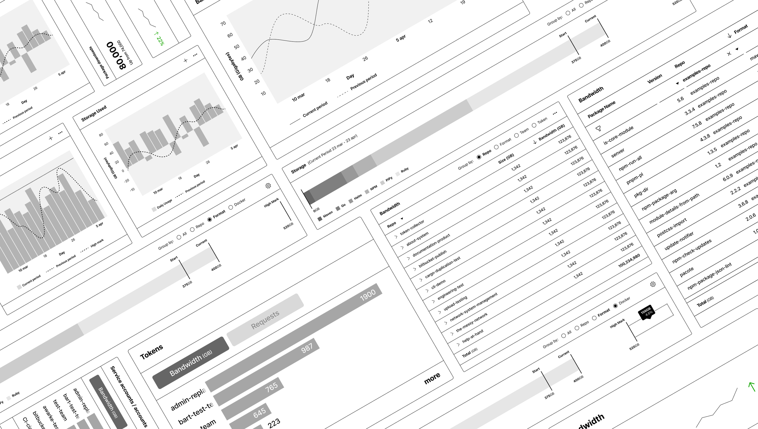
Experimenting with the layout
In order to test out combinations of our components we built out full page, wireframe prototypes of the dashboard to gather feedback on the decisions we were making. The components could be easily changed out with the resulting dashboard able to be tested with a select group of customers. The feedback we received helped us to iterate towards a final design.
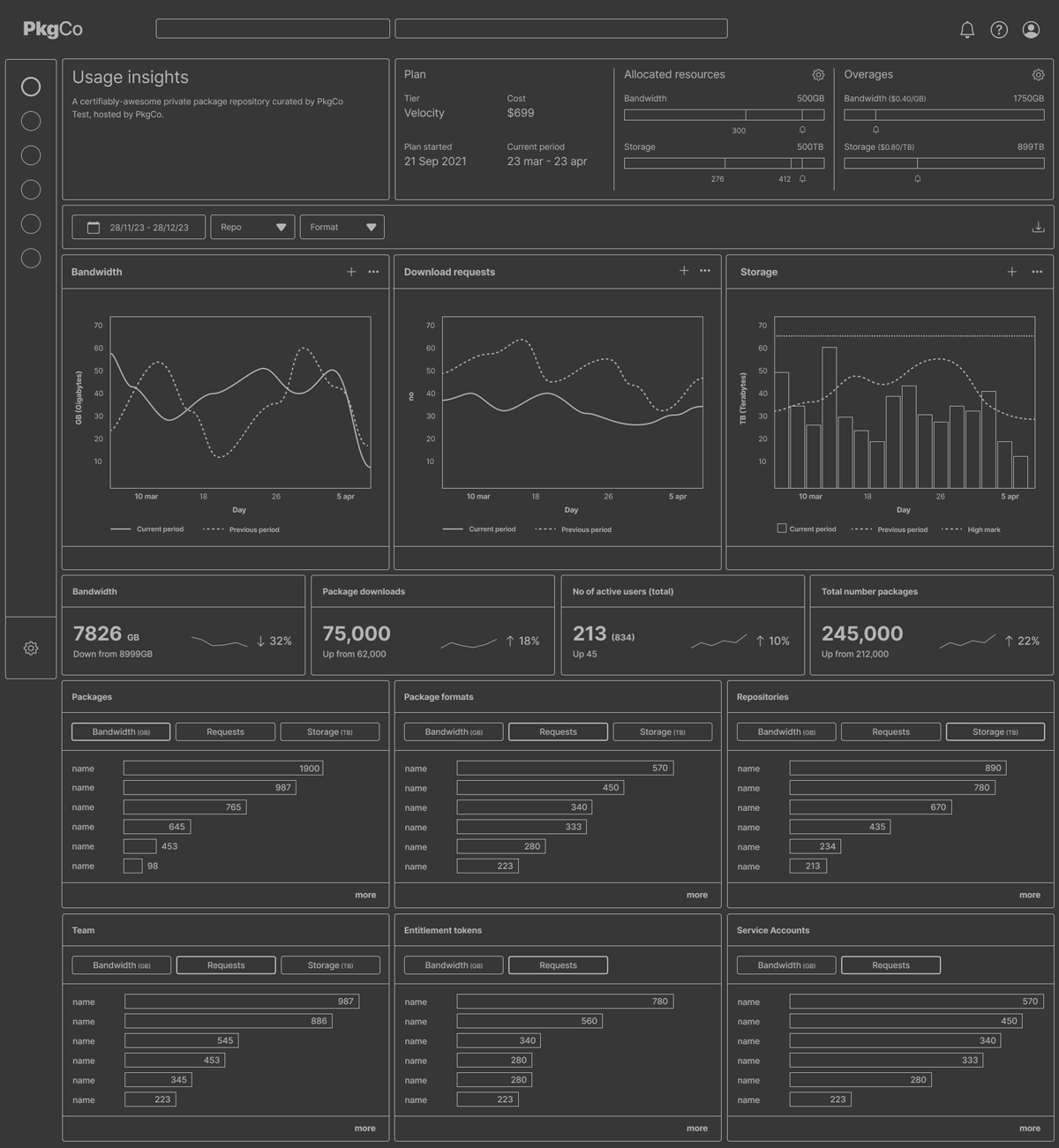
Developing the final components
Each component was carefully crafted to live within the broader design system. This work was part of a new initiative to overhaul an outdated UI, this became an opportunity to lay down some important groundwork which could be used to develop the rest of the next generation UI.

