Goodwood Hill Climb
The Goodwood Hill Climb happens, as part of the Goodwood Festival of Speed, once a year at Goodwood House, West Sussex in the south of England. We were asked to develop a unique experience which would be part of the Future Lab alongside brand names such as Siemens, Mastercard, Norman Foster Architects and Honda amongst others. Our idea was to build a display that would showcase our algorithm to the public audience by measuring the emotional journey of professional racers, in real-time, as they tackle the world famous hill climb.
Developing the mobile app
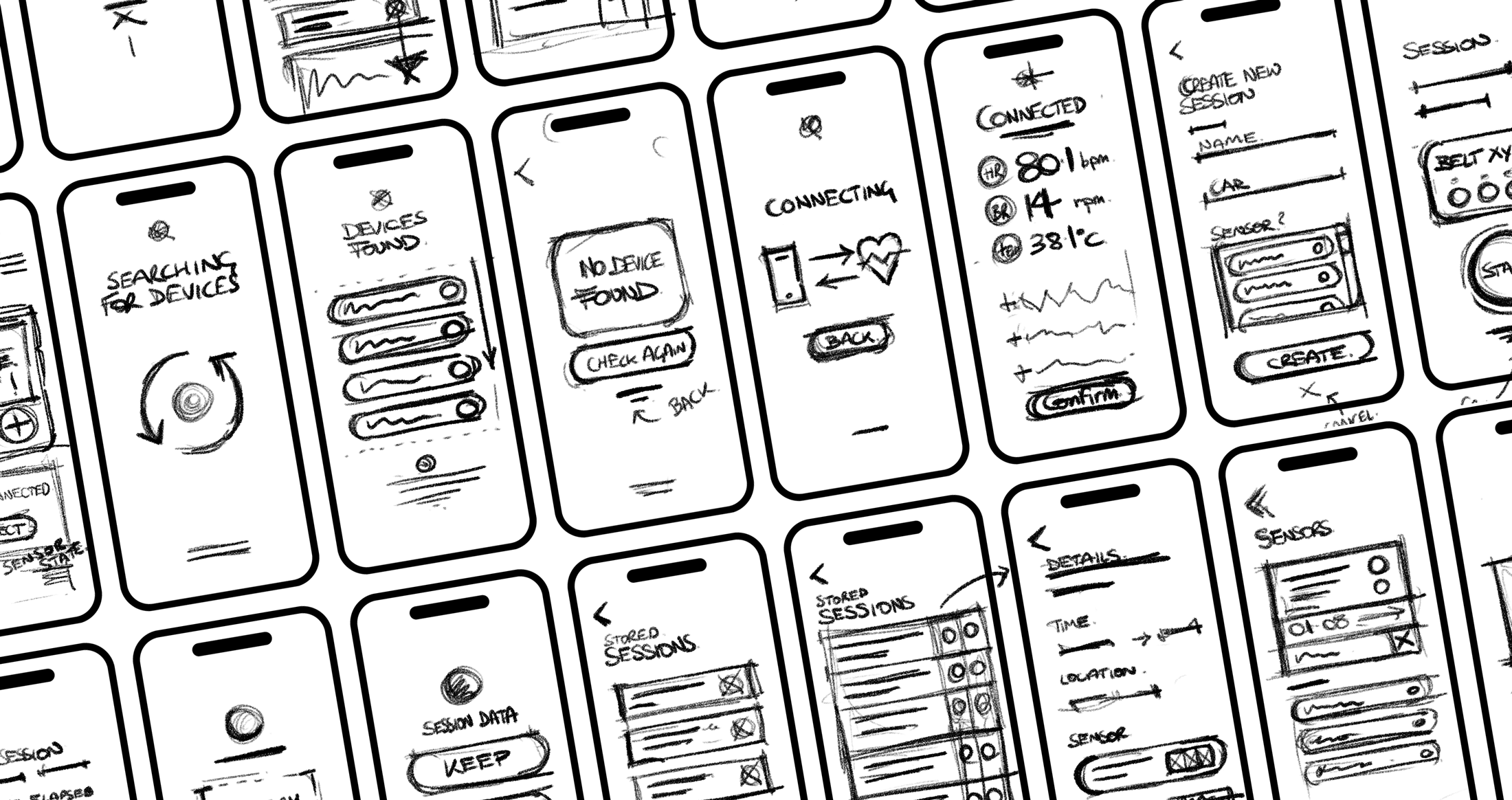
The mobile app is used primarily for collecting the sensor data and transferring this data back to the main hall where the server and big screen display are located. The app needed to maintain a solid connection to the belt sensor worn by the driver, the data would be stored in a session and also sent live to be displayed on the big touchscreen in the Future Lab. Below are some early sketches we used to rapidly try out different options, these were a great tool for achieving early alignment throughout the team.

Early prototype testing and development
To really get a feel for the mobile app we worked to build out early prototypes demonstrating the flow required for successful data collection and transfer. We could use these prototypes to test out different options and show how the parts of the application should work together. These prototypes served as a great way to communicate with the team, we worked hard with the engineers to make sure we got the balance right to deliver a feasible solution within the tight timeframe.
The screen attracted a lot of attention from the visitors to the Future Lab, from the feedback we got they really enjoyed seeing an extra dimension to the racing which our data presented. Being able to tell a deeper story on how the drivers body responded to different sections of the track really resonated with the racing fans.
Presenting the data
Post event we wanted to tell a compelling story with the data we collected. When we analyzed the individual sessions in a group, and mapped the data to a location on the track, we got an interesting pattern. Our algorithm output correlated well with the ‘wild’ side for more difficult sections of the track and ‘ice cool’ was represented more prominently on the easier, straighter sections.
The completed info graphic below helps to visualise these findings.

